Axis & Allies .org Forums
    • Home
    • Categories
    • Recent
    • Popular
    • Users
    • Register
    • Login
    1. Home
    2. Black_Elk
    3. Posts
    0%
    • Profile
    • Following 0
    • Followers 5
    • Topics 100
    • Posts 2,096
    • Best 184
    • Controversial 0
    • Groups 6

    Posts made by Black_Elk

    • RE: New TripleA Map UHD World War II Global

      ps. also, just since I was messing around earlier, here is Bung’s given the same treatment, morphed to 30x96 ultra wide for comparison at like 200 DPI for a quickie. I used one of those alt reliefs with a darker ocean just cause it was laying around in the folder.

      Effectively something where the entire map is about the size of a standard closet door.

      You can hold up the sculpt to the screen again between like 100% and 200% zoom to see how they’d square up there for a ballpark. For the physical sculpts I mean just to get a feel. The spacing is similar I think just with a different set of morphs for the initial map projection, more in line with the OOB look there, least for the contours.

      https://drive.google.com/file/d/1EXqtvSdyezVVctu2Ui7bfYoD-LAEvLXM/view?usp=sharing

      bungs ultra wide 96 dark ocean reduced.png

      For the UHD what I did was basically like an inverted Mercator I guess. So in the UHD the stuff around the Equator and in the Tropics is significantly enlarged, to magnify the main theaters of ops, and the stuff towards the poles is much more compressed. Then you get a similar sort of compression along the meridian that runs down the middle of board at the theater split (basically central Asia/Mid East area) where you get similar distortions. Mainly so the TT connects could strike the right way, or at least be analogous. I think that’s maybe a good way to think of it, like a funhouse backwards mirror invert on Mercator, stretchy in the middle, compressed along the top/bottom, aiming to work off the requirements of the sculpts.

      I think maybe 3 panels? That way it could also have support along a table split too, like if using 2x 6ft tables instead of a single 8 ft table.

      table comp.png

      Folded along the horizontal would probably work for like a single fold. Or 6 rigid panels basically at like 15x30 would also work.

      posted in TripleA Support
      Black_ElkB
      Black_Elk
    • RE: New TripleA Map UHD World War II Global

      @barnee Yeah exactly

      The nice thing is that the current default relief is already more or less dialed, like the opacity there is basically 100%, so I can change the color in the baselines for the ocean blue and it shouldn’t effect the display on the default. Unless the player is using map blends, in which case the hue for the blue just sorta keys off whatever is in the baseline map.

      Then for a secondary relief style, we can have an ocean which is essentially transparent, and shows the color through from the base. Probably darker or lighter than the current for that, cause map blends passes it through base at like 50% white, but whatever was going on there could be separate from the land patterns, of which I think we’d just want 2 options - A Revised style look more block colors, darker or muted ocean, or similar to the handling on A&AO where you get those lighter hues for the national colors - and then the sorta Modern post v3 AA50 style, where the battle board is more topographical with a vibe like fighting over the terrain rather than a map.

      For the OOB terrain style that color sweep is fairly dark for the topo/under-terrain and the control ownership color for overall visual is produced more by the units and roundels than anything on the map. I mean you know how it looks, a sliver of the national color along the border, but mostly it’s like mountains, trees, grass etc. There I think we’d want something more subtle than the above for a national fade to indicate the starting territories, so basically opening up towards the interior of the territories more than shown above. Like to have a transition in there from the border color into the forest/desert/tundra or whatever more at full opacity, with those national colors less pronounced.

      For that some of the default HEXs are pretty variable, like the default Russian red tends to pop a bit harder and would probably need to be knocked back a bit, till it looks cleaner next to the others. Or similarly say switching China back to be green rather than tripleA purple or whatever makes more sense for actual bits and pieces. Say the chips and roundels, the regulation naval sculpts etc. To give it a more cozy or familiar feel there. Anyhow just a quickie around that size in case you wanted to see how it might hold up stretched wide for the actual plastic and cardboard.

      posted in TripleA Support
      Black_ElkB
      Black_Elk
    • RE: New TripleA Map UHD World War II Global

      Oh also speaking of the local stuff, I just remembered that I need to update the alternative map reliefs, for those last couple adjustments. I’d held off there, being fairly convinced that another tweak would probably crop up, but I guess now that central Asia is sorted again I could bang out a couple.

      I feel like a lot of stuff can be controlled via the Hex colors in the map.props, and other features like map blends, or simply turning all the map details Off - and working up from the desired colors. Again the only thing that’s hard to customize that way is the color of the ocean blue, since for everything on Land we can just assign a new HEX color with a line of text in the map.props, but to do that for the sea zone color means either an alternative Relief map that covers over the ocean at 100% opacity using whatever specific hue, or ideally an alternative Baseline map where the blue there just shows through the Relief map, allowing the user to change that color with a single edit in an image processing program like GIMP, or PS, or Paint, like select/fill foreground color. The baseline is only 1mb, the relief is like 40 mb, so to me it just makes more sense to control that via the baseline. I’ve just been foot dragging cause matching the current default for that blue has been a bit of a chore, figuring out what exact hue of blue is needed on the base to give an identical look when it’s passed through the opacity layer. Always seem to come out a bit more muted than the current default.

      In any case I think other than the blue, I can see 2 displays that might be desirable. One that makes the board look more topographical using a full RGB topo instead of a desaturated one. And then another to basically look more like Revised (eg darker ocean color, white line boundaries etc.) I think with those 2 and the current default players could customize it their tastes fairly easily via Hex color adjustments.

      Beyond that I think an interesting challenge would be a print in physical media. Probably using graphite and prismas since I enjoy those. I’ve always been a shitty painter, but drawing I can kinda zone out hehe. So might give that a go.

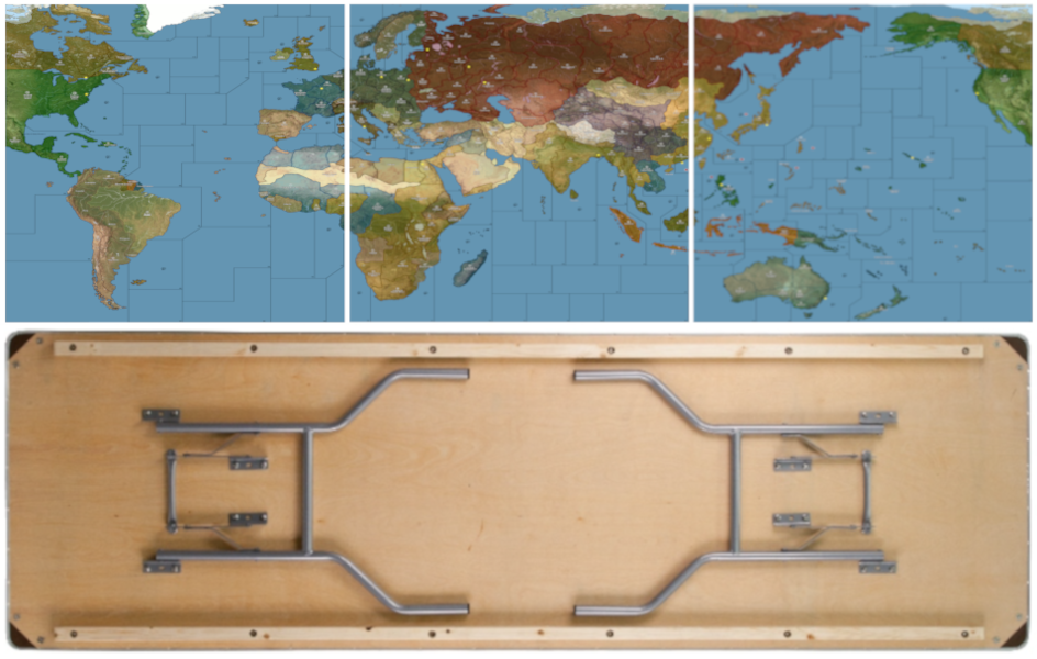
      I think the optimal sizing for a physical board using this same style of projection, would aim for roughly 30 inches by 96 inches. So covering the entire surface of a standard 8 ft banquet table, or else two 6 ft tables end to end (with 2 ft of space on either) side, and having the board-split between theaters match where tables come together. Corners are almost always rounded a bit, so probably lose an inch or two on the longest side to account for that with an 8 ft table, but basically taking advantage of the 30 inch depth as much as possible, right to the edge there.

      There are King-size banquet tables with depths ranging from 36-40 inches, but nobody really has those, I mean unless it some sort of specialty event you’re just not going see those floating around much. Standard tables, and most folding tables, or whatever you’re going to find at a Target or Home Depot, those are pretty much always going to be 30 inches. Sorta industry standard there I think.

      Right now if you took the current UHD in tripleA, hit export screen and printed it out at say 200 dpi, you’d get a bord about 28 inches by about 55 inches, so essentially a 6 ft table. Going wider to 8 ft, I think gives a better stretch to use actual physical sculpts which are significantly larger than the digital sculpts relative to the map scale.

      Print would look jank since it’s not a dot map, but for a quickie it can be done using just like a regular inkjet and taping the pages together to get a vibe on it. Colors register quite a bit darker in pigment rather than light, so all the hexes are a bit of a guessing game there. Like I’d want to do a bunch of AP runs just to see at a smaller scale, but it sorta works like one might expect. Basically fiddling with the opacity of the land pattern (whichever is chosen, here it’s the topo in full color) to get something that recalls the OOB design, just with updated contours and such.

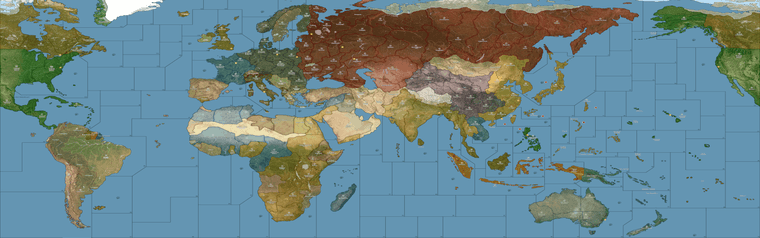
      Basically a bit like this, just using one of the reliefs I had that’s vaguely OOBish for the color design… Imagining it to basically fit the entire 8 ft and ultra wide, like stretch armstrong lol. As if it had to fit on either one of these or two of those. I think 2x 6 ft tables is optimal because then you’d have space on either side for drinks, or rolling dice or overflow panels/battle boards/extra map extension boxes and the like. You know like just using markers to associate the overflows with whatever space. Then pictured with the little cardboard roundels and such to indicate ownership changes.

      https://drive.google.com/file/d/1VnBVYJkZU3pKRtE0_rVm_W7w_2RZyFp4/view?usp=sharing

      g40 terrain print 96 inch_reduced_preview.png

      banquets.jpg

      For sculpt housing, the issue there is not so much the land but the sea zones, since those need to be fat enough to hold the pretty long and quite beefy carrier decks, along with whatever other naval units - ideally without chips under ships, least for the starting set ups.

      Everywhere on the OOB board where we get the heavy distortion most of that is to make the sea zones sufficiently large to house the naval sculpts. The ground units and aircraft are smaller and easier to fit since they’re rarely much larger than a chip. But some naval units can be 2, 3 almost 4 chips in length, so they need a lot of room and blockier tiles to fit well. I think it just about works if doing a stretch extra wide, because that buys precious extra inches, especially in the sea zones, but really across the whole board.

      So why you get that sorta switch from a convex shape on Africa to a concave shape, in order to make the Med very large. Or the contortions on Europe to make the Baltic as large as possible, or how some stuff tilts to create that telescoping effect around Europe and the Pacific we see in OOB, stuff like that.

      You can ballpark it by doing say a 100% compared to 200% zoom and just holding the sculpt up to the screen to see it roughed out. There are few tight spots, but usually those are next to a neutral overflow type area where ships can sorta breach into say Sweden or Arabia, the way we tend to do when space is at a premium. But then another easy option is to say put a row of generic boxes along the top of the board, or a production counter or tech counter along the bottom, things of that sort, but I think ideally you’d just run it right to the edge and have those as separate float panels. Especially since the sides could be extended more easily than the depth. Even still, you could cut in I think a couple inches on either the top/bottom and not be losing too much.

      For morphs if anything, I’d probably just stretch South America slightly so it reaches further south so more closely mirror the reality, but otherwise I think the telescoping works reasonably well, with fewer tilts needed to make it all work. Downside is that the sea zone geometry is invariably going to look slightly different doing that, but that’s the trade off trying to get the contours of the landmasses to have a bit more fidelity. I mean there’s only so many things one can do to make Europe and Japan all extra jumbo without losing something else along the way, but seems to work alright as a compromise.

      For something like that I think it would be fun to use the baseline projection as an actual stencil, blow it up to life size and then do a mock up in prisma color on something like bristol board, and carry it the rest of the way from there. If I ever get up the juice, and enough ink to mess around lol

      posted in TripleA Support
      Black_ElkB
      Black_Elk
    • RE: New TripleA Map UHD World War II Global

      @pacifiersboard you should be good I think, since all the graphics are local to the individual user. I wouldn’t expect it to kick off any errors unless it’s a different xml/gamesave. So far example, you can customize your own units or flags in those local folders, and they’ll show up that on your screen with whatever you put in there, but on the opponent’s screen display as whatever graphics they have in their own local folder. Or you can customize them to other stuff, as long as the labels match what’s in the standard game. You can also change the Hex colors around for the different nations in your map.properties locally, so people can choose the colors they like that way.

      I was trying to play it using a few different views, a high vibrancy sorta hi fi for the default, but then if you want to punch up the contrast between the units and the map, or use the standard tripleA G40 units, those may look closer to the tints using either map blends or some lighter Hex colors for the nations. Also if you like a more simplified revised-style look, can click all the map details to off in the view options, and it will sorta time warp the look of the thing back to the way tripleA in the aughts hehe. Like with like no relief - just sorta bare bones. With map details off that way, the max zoom out before some of the sz border lines start to breakdance is about 50% I think, but should hold to at least that scale. 60% mapview I think should be good to go for whatever.

      For the flags/pucks that show in the UI those will scale depending on Font size you have set for the main display on computer, so when I use tripleA at 1440 or 1600p I have to upscale my Font to either 125 or 150% for some of those images to look good at that higher resolution scale. Basically just tried to do what I could to go from the older 4:3 sorta display to something that’d work with the super zoom or a wider stretch there, but for the units those are all sorta set by the standard dimensions from when tripleA was first made. 54 was as tall as it would let me go before they started clipping at the top/bottom of the UI windows. Flags were sorta the same, like with a hard ceiling there for how it was set up initially for the stats I guess.

      The larger flag pucks for units were somewhat harder to center, sometimes they’d cover over a bit or be like dead center behind the tank. Just sorta depends on how beefy the unit is. What would be cool is if the units could go extra large like the same way the map can super zoom in 2.7 and then position the flags or roundels around them, but not sure if that’s likely to happen any time soon. As I recall that was the main reason for going with something about 11000x5000 px just so that the units we had available wouldn’t look too tiny relative to the size of the map, but I think something slightly wider and just a bit taller might be cleaner for the 200% zoom in thing. Might try for a sping project if I can get up the juice. But meantime hopefully it’s not too hard to tweak around. Let me know if you hit a snag, we can probably figure it out.

      Best
      Elk

      posted in TripleA Support
      Black_ElkB
      Black_Elk
    • RE: New TripleA Map UHD World War II Global

      For sure!

      To do that you can go into your downloaded tripleA maps to the World War II Global folder, and copy over the Units folder to the UHD to use the larger map with the OOB units. Or vice versa. Should just be like a plug and play there. Or similarly you could copy over the flags and such. The final display for those graphics will show them slightly smaller since the vanilla units are 48 px tall and square, whereas the UHD are 54px tall and up to 96px wide. The placement of the units relative to each other should worth fine though, since it’s keying off the larger sizes you shouldn’t see like overalaps or anything I wouldn’t think. You can upscale the units a little bit too, I think I have a set somewhere where all the 48 pxers are enlarged via a batch edit to 54px, keeping the graphics the same but just enlarging them manually instead of inside tripleA. Right now the limit for unit view is 125% but for the 48px units from standard tripleA I think we’d want something more like 150%-200% to match the zoom. It definitely should work though even with the regular units just dropped in. Especially since they’re more familiar it’d likely be easier to spot em at the slightly reduced scale.

      Let me know if that worked for ya, and have a blast!

      posted in TripleA Support
      Black_ElkB
      Black_Elk
    • RE: League General Discussion Thread

      Oh wow! I only just caught this right now. I get the email push sometimes. Knew it had made the rounds here and there, but league action is next level! That’s badass! Hopefully got all the connects sorted now, but if not, I guess I’ll find out real soon hehe

      Yeah I think it should like totally work with all the BM right? Cause the stuff simon33 mentions for balanced mod I just ported straight from the standard G40. That was the hope at any rate, that it would function the same way, just with a bit of a glow up for 20 yr anniversary tripleA, but still working for Balanced Mod, or Oztea’s or any of the standards. Anything like that based off the main game, cause for the main XML basically just the same thing going on as vanilla. Plan was to a quick flip version that would work also for some of the 2.7 features, and also to get the map blends working. Like so the sea zones lines and such wouldn’t break when zooming in/out. I think there’s a quick skin for Revised style colors too, or to blank the terrain or switch to a pattern if some of that is distracting. Or just to snap up the unit art and throw them into the regular G40 folders, if peeps just wanted those Frostion digi sculpts tinted out for National Colors. Kept the labels the same so should be able to plug em in that way if desired. Some of it’s a little wonk for the map, like the Aden/Trucial States getting attached to a nearby tile. I think for an easier read, could probably just do a neutral thing like there like OOB if it makes more sense, or like if one wanted to the same for Sakhalin or any of those additions for stuff that’s cosmetic. The TT connects are the same as vanilla, since that was the XML used, so I think that’s just like one line in the polygons txt to do a quick switcheroo for any TT like the stuff around Arabia.

      I think the next step if it works well, would be to upscale to from 11110 px to 16000 px and do a slightly larger relief, since I have the topo-under map ready at that scale. Just takes some time to go back over the lines for the borders and such to do the two tone thing, or for the highlight effect in tripleA when a territory or sz is selected. I’m running GIMP on gaming laptop, which works fine for 1080p gaming but kinda lackluster for image editing, so sometimes it lags hardcore when the map is really large, so trying to reduce the number of layers I need to make it work, before going jumbo again. I think it’d be simpler now, since the hardest part was trying to do all the morphs to get it aligned with OOB.

      Sorry, been super MIA for ages it feels like. Got some RL tethers trying to help get the fam sorted, so I’ve been super light footprint. 2025 already! Time travelers paradox, good to see the old crew still rocking!

      Good gaming all!

      posted in League
      Black_ElkB
      Black_Elk
    • RE: OOB Oysteilo +40 v Gamerman01 with tech - UHD map

      Oh damn good lookin’ out

      OK here are the drive links with all the corrections made to the tile folders and the polys. I think Bill knows the drill, but should just be able to slide in the base and relief tile folders.

      What I did was just to stretch Yenisey then hit the surrounding area with a bit of blur so it wouldn’t look to jank. Sorta best I could swing on short notice so I wouldn’t have to rework to much. Hopefully does the trick. I was a space cadet that first time, I mean I remember trying to fix the Novos-Kansu border so maybe that’s where I goofed zoning out. Who knows but good catch all the same! :)

      Give the gang my best too! I’ve been out of town for ages. Took me a while to dig up my login here heheh

      UHD map fix

      https://drive.google.com/file/d/17NrUP1SFxKZsnQaNDnvhQk_qxtwomYEh/view?usp=sharing

      Then I did the same for that other map UHD Boxes Expansion fix so they’d match up. Same deal there, it has the tiles already run through the breaker, but I threw the single images in too, like same thing you’d get from running the tile-reconstructor just in case. Called the zip Boxes for short.

      UHD Exp Boxes

      https://drive.google.com/file/d/1_e54Q9_CnCBC9dl2LEfXuTWGHvHGk-5p/view?usp=sharing

      Let me know if it does the trick for ya

      Best Elk

      Screenshot 2025-01-05 152429.png

      posted in League
      Black_ElkB
      Black_Elk
    • RE: SuperbattleshipYamato (Navies) vs VictoryFirst (Armies), Armies vs Navies, a Global 1940 Second Edition variant

      @VictoryFirst

      I hacked together a quick fix for you guys for sz 64/65. Posted it to the thread. Let me know if she does the trick. Just need to replaced the BaseTiles and ReliefTiles folders with those updated ones and add in the Polygon txt for the new shapes.

      I can copy over the changes to the expansion boxes map when I get back to my house in a couple days.

      Thanks again for hunting these down! Tough one to spot right there for sure. Appreciate the extra sets of eyes hehe

      All the best

      Elk

      posted in Play Boardgames
      Black_ElkB
      Black_Elk
    • RE: New TripleA Map UHD World War II Global

      @barnee @VictoryFirst

      Here is the update for sz 64/65. Probably gave me the slip cause it’s harder to see the map wrap in GIMP. I just hacked in a couple lines, hopefully passes muster.

      Looks like so

      screen.png

      Here is a zip folder with a BaseTiles and ReliefTiles folders updated (already run through the tile breaker.)

      https://drive.google.com/file/d/1nqernvZtD8MYOstgAblw8DDZ4Hrk4JLb/view?usp=sharing

      Here are the Base and Relief as single images

      Base
      https://drive.google.com/file/d/134oogwEtlLW1kkHR_zvvXJCpDtUxiDzH/view?usp=sharing

      Relief
      https://drive.google.com/file/d/1zRi0q7AqTQrHfCikDEnW1aAw5J5QRe0Y/view?usp=sharing

      Here is the Polygon txt attached below

      polygons.txt

      Let me know if that works for ya. I’m pinballing around at the moment, but I can update the other boxes map/polys on Friday. Or you can just copy/paste that section over from the UHD if you need it before then.

      Thanks again for helping me catch all these damned connection goofs lol. Hopefully we nailed em all! Good work gang

      posted in TripleA Support
      Black_ElkB
      Black_Elk
    • RE: SuperbattleshipYamato (Navies) vs VictoryFirst (Armies), Armies vs Navies, a Global 1940 Second Edition variant

      @VictoryFirst

      Good catch! Probably easiest is to angle and drop the line off Peru to comes down. Should be a simple enough fix to the baseline, I just need to cutout the new line in the relief. I’ll try to get it sorted by the weekend

      posted in Play Boardgames
      Black_ElkB
      Black_Elk
    • RE: New TripleA Map UHD World War II Global

      @barnee

      Here’s a quick edit that should be serviceable for now. Just needs a little touch up for the blur.

      zip with the BaseTiles and ReliefTiles for the map folder

      https://drive.google.com/file/d/1ZkhnF2Dzwx-9K2vUFWLqI-rE1WwDLafA/view?usp=sharing

      Here is the txt file for the polys for the shift

      polygons.txt

      Should look like this when you fire it up. I can clean the border fade a bit later. This was just to strong arm the line into place. I tried to leave a little bit on the Afghanistan side just to suggest the shape. Just like pretending the frontier there is sorta disputed. Makes sense hopefully.

      Screenshot 2024-08-02 143410.png

      posted in TripleA Support
      Black_ElkB
      Black_Elk
    • RE: New TripleA Map UHD World War II Global

      ps. I was looking at this image when I made it initially. Well not this image exactly, now for some reason I can only find that map on Etsy, or at one of those image clearing-house sites that seem to have scooped everything and put it behind a paywall in the past couple years. But anyway you can see off there to the righthand side the Wakhjir Pass that leads to China. Like since ancient times Silk road style, but it’s pretty tiny so I think OOB it just gets clipped or abstracted into the Mountains next door. Just a holdover from the larger map probably. We’ll nix it to avoid the confusion.

      central asia 41-2 capacity.png

      The sea zone Geometry is harder, just cause so much is already in place. If I had it to do again I’d probably rework the warp of the entire globe to make it a bit more G40 OOB-esque. I imagine the OOB may have been drawn by hand or using the warps and such, like in Photoshop to stretch and morph stuff. But because tripleA needs the baseline at 1px and 100% black it means retracing the entire thing to do a big warp change like that. Otherwise the lines will have interpolation applied and go fuzzy when using the transformation tools. Plus it would nix whatever is already going on with the coordinates in the polygons files or the place files. OOB is basically 2:1 aspect ratio, like where each theater board is a square. Here it’s more rectangular like with the whole thing targeting more 16:9-ish. That’s like before the compression for the Global south that you’d see on the OOB map, I just mean the overall dimensions. Also how North America is stitched in/re-sized. It means the horizontal lines will strike at different spots when trying to match the Sea Zone shapes exactly. Kinda tough, I wasn’t able to find an awesome solution, but I also didn’t really start with the G40 in mind, which made it unnecessarily complex there probably. Like if I’d just started from the G40 might have been easier to move a couple islands around or stretch Asia and North America to fit just so. Maybe for a 2.0 if I ever get around to it hehe

      posted in TripleA Support
      Black_ElkB
      Black_Elk
    • RE: New TripleA Map UHD World War II Global

      Good catch!

      I’ll fix it up over the weekend

      I think that part of the board gets a little tricky just cause it’s where the two sides of the map meet OOB. Looking at the cardboard version, I think basically that portion of Afghanistan east of Kunduz with the little strip was sorta folded into the neighboring impassible tile there. I think we can just carve into the tip a little bit to remove the errant connection.

      Yeah I agree the geometry for the Sea Zones in the Central Pacific can be a bit awkward in translation. I think I spent many many hours just looking at the board on my carpet, and then on the laptop to compare and see if I was managing the connections alright, and still had a bunch of stuff giving me the slip.

      For OOB you got that situation where the naval sculpts are pretty large, so the sea zones need to be extra beefy to hold them all. I drew the landmap first for that other board, then collapsed a bunch of the boundaries to get back to the G40 playscale. Sea Zones were the last thing added. If I was going the other way, I could bend the land territories to fit the more familiar sea zone shapes, but I started with the warp for the continents first. Here I basically tried to preserve the contours of the land, and then bent the sea zones to match, if that makes sense.

      It’s sorta hit or miss in some spots just because of the overall shape of the continents. Like if prepping for the tournaments there’d be an advantage to using Bung’s, just cause those sz shapes fit the OOB and the land is more abstract. To me it felt somehow more believable to keep the land territory shapes and those contours a little truer to reality and just adjust the abstract sea zone shapes where I had to. I mean there’s still hella distortion all over the place, but just that idea that I could try to make the shapes a bit more familiar in South Asia or Coastal China, or a bit less compression going on for Africa and such. But then where the horizontal lines strike into the coastal TTs, had to make some adjustments along the way. Part of it was just trying to get some of those lines to hit the right coastal territories, when the stretches weren’t quite as extreme.

      posted in TripleA Support
      Black_ElkB
      Black_Elk
    • RE: NML 1914 game 13

      I didn’t even notice this sub-section till just now lol

      13 team games!? That’s pretty rad

      I don’t suppose anyone wants to tool around with the map? I upscaled the old baseline I had using same method as the other jumbo maps, but I’m kinda spent. There’s a fair bit of tedium in re-assigning the centers for the enlarged map. Once the centers are assigned it’s much faster to re-run the polygrabber in the map tools to enlarge everything.

      https://forums.triplea-game.org/topic/3803/uhd-domination-nml-upscaled-baseline

      posted in Team Games
      Black_ElkB
      Black_Elk
    • RE: How do I create my own custom A&A map from scratch? (Global 1920)

      Sorry only just saw this

      So step one would be finding the right image editing program for what you’re trying to achieve. TripleA uses raster graphics images (basically png) and is not suitable for printing. Upscaling the largest relief I’ve made in tripleA and trying to print it at 600 dpi the filesize gets quite beefy. Basically an image that’s like 50mb for use in tripleA is going to climb way up by orders of magnitude into the many gigabytes. It will also tax the RAM pretty hard if you’re trying to edit an image that large (in actual dimensions) like trying to use multiple layers at once. I have a pretty high end gaming laptop and I topped out around 8000p before GIMP started giving me headaches and slowing to a crawl.

      What you probably want is an image that you can manipulate as SVG rather than PNG. A vector so you can upscale the image to any dimensions that way (basically the same way font works.) I would try Inkscape or Adobe, and try to get a pull of the image as a vector graphic.

      You can start the same as you would in tripleA by creating a baseline image of the basic world map, the continent contours or world warp you want and the territory or sea zone divisions, showing just the basic borderlines in 100% black at 1px width at the desired dimensions for the digital thing.

      A physical print would be much larger, so imagine that on your screen you got 72p per inch, on paper that needs to be 600 dpi. You can go lower say 300 dots per inch if it’s very graphic, but a photo quality print is basically like 600p, which is pretty hefty. In a program like inkscape or illustrator etc you can translate a raster image into something that works for stuff like signage, you know, so like making a giant banner image to put on the side of a truck or hang outside a building - same sorta deal here for the scale of the image you’d want to make. Probably the size of a 6 or 8 foot banquet table, possibly larger depending, on what you’re trying to pull off.

      If you have the map drawn out at scale, you can scan in sections at A3 or A4 size with a flat scanner and then reassemble the image, to pull it at the highest resolution you can before bringing that image into inkscape to create a vector of it.

      ps. here are some youtube tutorial videos on inkscape just to see what sort of stuff I mean. You can probably find more just pulling at those threads. Once you have a map design you can put in tripleA to playtest it by creating a baseline from your svg, exporting the image as a bitmap or png where the borderlines are just solid black ideally at 1px width for those lines, or as close as you can get. For a map image something that’s like 2000-4000p tall and about twice as wide or larger works well for digital sculpts which are png images at 48-54px tall up to 125% currently in tripleA. The map size in tripleA is sorta limited by the unit graphics sizes and the windows in the UI. In inkscape you can make it larger, like for whatever makes sense to have the print look decent. Anyhow, just a quick example you can skip around to see

      https://www.youtube.com/watch?v=6Ns028ihACs&list=PL_NagE_y_IhIBNAzw3nFBiF01OKnaltmJ

      https://www.youtube.com/watch?v=DnqtnSTe6qM

      https://youtu.be/kS2nrXuR128?t=2611

      for tripleA you can use GIMP to make the relief images in png. Here’s an example of similar videos in that program

      https://youtu.be/HLmOpEETjEo?t=646

      posted in Customizations
      Black_ElkB
      Black_Elk
    • RE: Names to Faces

      ps. @barnee Amusingly, I didn’t even realize this was a separate thread until right now lol. I just clicked the little notification to bring me here, thought it was the other UHD thread, so apologies if the above/below sounded sorted confusing. I thought it had just kicked on to a new page. I actually forgot there even was a General forum down at the bottom of the tree lol.

      @Panzerstahl-Helm Yeah this is like the main thing that appeals to me about tripleA, the fact that you can go under the hood and tinker. Sorta like painting sculpts or using pennies on the physical boards to do whatever. Some of the original graphics have been adjusted many times to change the tint colors, add drop shadows or things of that sort. The main thing that sorta organized most graphics is that they were 48px squares. Though tripleA can go up to 96x54 px. The extra 8px tall isn’t the most massive ever, but the extra width is pretty significant, since that’s almost double if you use a graphic that is say 2:1 rather or 4:3 aspect rather than 1:1 aspect. For stuff like tanks, aircraft, ships, bases etc this is pretty huge. But when I wanted to try and do an upscale for global the only set of tripleA WW2 units that attempted to go jumbo were Frostion’s, so I asked him if I could use those to create a national tinted set. In his game the presentation was more fully painted with a roundel at the feet and a 3/4 drop shadow on everything.

      Mainly I just removed the roundels and shadows and colorized the units for a monotone tint in the same color family, then went back in and painted on some faces or a safety color. Essentially to make it looks more like the standard World War II sculpts (which are totally monotone) but just larger and with some flare to spice it up. I added basically main infantry units and whatever tech stuff was missing, so mostly aircraft to fill in the gaps there. Basically substituting the graphics in the standard folder for the newer stuff at the larger size. Most games don’t really work like that, like where you can just open a subfolder and see hundreds of tiny png image files of like everything used in the display the way you can in tripleA. To browse around see what’s there, replace stuff by using a different file with the same label etc. Typically that stuff would all be just encoded I’d guess. But tripleA is so oldschool that you can just see all the tiny rasters for everything and get a sense of how they come together in-game.

      This is great for stuff like customizing and house rules, but then there’s also a dilemma of uniformity or standardizing stuff so that it looks cohesive and doesn’t depart too much from the basis. That’s what I meant about the whole pg13 thing and sorta separating off the main materials from whatever additional stuff. Because one can go in and and explore other aspects in more detail via mods and such, but when it’s all in the standard folder kinda gets confusing potentially.

      Current Global package is very much like that, where there are additional graphics to support all the mods and whatnot inside the main map folder. This is why it was challenging initially to know which stuff actually needed to be replaced or which graphics where just like holdovers from other iterations or only used in a mod say. Initially I just copied everything I was using into my UHD global folder to keep it all together somewhere, but now I think it’s probably a bit easier to have inside the UHD only the stuff that is actually used for standard Global, and everything else can live alongside that in some separate customizers/mod folder, or basically separate maps for separate mods to keep the main one lighter footprint. I don’t know that we’re going to do much better than like 80mb, even if removing all the extraneous graphics, so it’d be more just to keep it orderly. Most of the filesize is coming from the reliefTiles themselves, since the single image is quite large.

      TripleA can’t use svg really, like for anything other than font, and even that if displayed in the UI is treated as a raster graphic, so the main map image we see in-game, the relief is just a giant ass PNG. It get’s pretty hefty the more pixels that have to be displayed, especially if in color. At first I tried to do this UHD thing at like 16000px the same as the other big map, but I had a lot of difficulty there since the image becomes so large and it’s a challenge to say create an image off it in GIMP with a dozen layers. At 11000px I was able to get maybe 6 layers going at once before GIMP would just devour my ram and start locking up, like any sort of filter or copy/paste action taking many seconds and the whole map to take a few minutes to export. And that for an image not particularly crazy, like these reliefs are sorta basic and bare bones in the grand scheme, but then the unit graphics sorta carry it, just cause they’re all jumbo and have a bit more detail.

      Anyhow, to the earlier point, if looking for some familiar faces I’d restrict it just these figures… Not these box cover illustrations but perhaps the photographs they painted from, or just the same figure in a different photograph, or stuff like that. Basically for the stuff that is in print

      aap1940-2998.jpg

      aae1940-5876.preview.jpg

      the 1941 starter board just uses the same box cover art as the Anniversary.

      1942 Spring, and 1942 second edition, A&AO all use the same illustration.

      I think probably any historical figure depicted on a box cover since AA50 came out would be ok to use for a visual, but probably comes down to how it’s purposed. Like if you go to the source image, not the painted illustrations I mean, but the dudes depicted. So like you see on the boards for Japan like Genda and Yamamoto, I think maybe Hara? Like usually IJN seems to be the theme there. Basically the films Tora Tora Tora or Midway. The theater boards tend to show more like the regular GI Joes, but I think Guadalcanal has like Nimitz and some other dude who’s face I can’t recall right now. The Pacific board 2000 didn’t have figures just painted aircraft and ships. Europe 1999 had sorta the generic soldiers in a photomontage. I think the more recent boards post AH aegis are sorta more in the ballpark.

      It’s hard for me to remember who painted what or when, but Jim Butcher, Beasley, Sansaver etc the gang there all kinda set the art direction over the years so that it’s fairly consistent from board to board even decades on. I think the stuff from the 80s and early aughts still looks pretty cool, but for figures I’d stick to the more recent boards for the changing times. Anyhow, massive digression there. Glad you like it though! Have fun out there!

      posted in General Discussion
      Black_ElkB
      Black_Elk
    • RE: Names to Faces

      For sure!

      Yeah, there’s like some sort of weird uncanny valley aspect too, like when the game becomes a bit too realistic that way visually, sorta loses an element there which I kinda dig. So in Iron Blitz for example, it was just a name and some stars, sorta at the level of Looney Tunes cartoon, but not fully visualized in any way.

      I think what might be more interesting is some sort of caricature of a General, or probably even better would be just some Officer Corps thing, or an advisor who could maybe grimace when the dice go bad, but without going much beyond that. Then one could give it the flavor, but without going out in the weeds. I think the little gif style video clips or newspapers clippings, or even the cool end game stats graphs could probably do a similar type of visual flare but I don’t know how to do that stuff really. Like the sound or animation stuff. But yeah sorta cartoons and penny flyers, I just feel like that fits the plastic army men vibe of the thing somewhat better somehow hehe.

      You can do whatever makes the most sense, but to me it’s sorta not necessary for a global style game, but then I didn’t really know what all might be useful for an expansion really. I found for myself that, as it starts to look more realistic in the vibe, the uncanny valley starts to open up. Even with the map I see the same, like if you magnify in too close on a topo it sorta starts coming apart at the seams a bit in that way, but then the cartoon aspect kinda compensates with map colors or whatever. Kinda trippy how that works

      ps. Anyway I’m kinda rambling, the short of it would be something like just trying to keep Global more general audience or pg13 in the vibe. I think there’s probably room for other takes on it as well, but for the regular game probably anything not assigned could get nixed? Then whatever else just lives in some sort of customizer thing where peeps can riff and do variants, in the same ways they do on the home board. At first I was thinking just put a bunch of stuff in so it’s easier to play around with, but then that could get confusing if trying to figure out which stuff the game actually uses, like for tech say or default options of that sort, as opposed to just like random HR idea I had once hehe. Basically so that when they open the Global folder or the UHD analogy the player would sorta see the same stuff in the same place, like even if the graphics are different, same folders and such, just so they’d know what’s what like that when browsing. Anyway, just let me know, whatever seems best or easiest for you. I’m playing Dragons again, so just hit me up if ya need anything dude. Catch ya next round!

      pps. oh and just one other thought, so for the commander dude graphics, if any, I would probably follow the cues from the Box cover art of the OOBs, but like post AA50. Meaning I probably wouldn’t highlight any figures that aren’t making those more recent covers. The old MB box art blue box from 1984 and even the Revised box from 2002 features figures and flags that I would just avoid in 2024. Like if the they weren’t in Tora Tora Tora or the film Patton as an already semi iconographic figure, but even the poster type art for a box cover or manual art feels different than say a piece that moves on the gameboard. For that it’s almost like you’d rather see something off brand, than big name historical figures, since it’s always kinda dicey. Faces are somehow charming though, and I think there is something to be said for providing something to RP against. You know so like instead of pretending to be anyone specific it’s more like some other name or just Commander 1, 2, 3 etc. I think if it was more like random non commissioned officers who pop up in some news reel at the end of the year, or in a battle screen, you could sorta capture that. Like those old Might & Magic games where dudes look upset and scowl cause the battle is going south lol. Maybe like an operator who patches in the news from the front at round’s end, ticker tape style. For a general or admiral type unit that plays on the field, I’d consider just some extra jumbo Tank or Ships or Sculpt-look inf type, an abstract Chevron maybe? Not sure though, I’m not familiar enough with those house rules.

      posted in General Discussion
      Black_ElkB
      Black_Elk
    • RE: Names to Faces

      @barnee

      So those are extra images that were going to be for commanders in the variant 1941 game. You could probably ditch em all from the standard package since they’re extraneous, and cause I also put those in the extra folder with map making stuff. Sorta your call there, what all to include. Like there are some extra tanks and whatnot as well. Mechanically those Commander units were going to work sorta like bombers, except also as a ground/naval unit which boosted the attack/defense of other units.

      I used each of the Generals from the Iron Blitz 1999 game, plus a few more for the pick six. I tried to avoid some of the most horrid Nazis and also tried to go with peeps who got their comeuppance and died during the war rather than being hanged afterwards, so nope, not Goring. I had them as Command 1, Command 2 etc, cause I was less interested in the named figures and more just sorta generic visualizations like for a general staff. The general idea was to avoid sus RP, by avoiding the political leadership and focusing on the military, or just choosing peeps on team Axis who would be less fraught or maybe just completely unrecognizable, which seemed somehow preferable. That was a bit of a challenge, so I’m not sure it’s entirely satisfying. Like initially I just wanted to go with a broadcast TV hogan’s heroes type thing, or just to keep all the basterds inglorious or whatever.

      For G I had Manstein, Rommel, Valentine Hube, Kesselring, Guderian, Doenitz.

      For the Soviets it was Zhukov, Konev, Vatutin, Vasilevsky, Rokossovsky, Katukov

      And I just did something like that for each of the big 6. I picked most of them for reasons of having like the right hat for the job, more than any sort of statement about who was the better random general. In Iron Blitz it was 5 star, 4 star, 3 star, but I didn’t try to follow that idea. There’s probably a rogue email or post in that thread somewhere that I had em still labelled, but yeah you could probably use whatever. I basically just cropped what I could find that had a vibe into a circle and colorized them in a couple cases where I could only find BW stuff. There are like a million of these sorts or portraits floating around, particularly in the Hearts of Iron game series, though I tried to riff off stuff that was in the wiki rather than those.

      Yeah that’s Ike and Bradley. For my thinking it’s kinda better to push it pretty Hollywood if going that direction. Like I almost just did George C. Scott for Patton and Karl Malden for Bradley, cause my aesthetic is basically technicolor flicks of the 60s and 70s.

      Or like for the dime store balsa wood flyer, pretty much this is my jam… I just think it works better generally hehe

      50-cents.png

      posted in General Discussion
      Black_ElkB
      Black_Elk
    • RE: New TripleA Map UHD World War II Global

      That just totally made my day!!!

      Have a blast out there!

      posted in TripleA Support
      Black_ElkB
      Black_Elk
    • RE: How to change color of seazones?

      Ok here is the last step, changing the lines from dark to light.

      I removed the interior pattern so it would be a bit closer to Revised look. Then pasted the baseline on top of that layer. Basically just taking the baseline expand by like 2px say with a little blur. If you take that and make it half opacity you’ll still have the tripleA highlight effect working.

      Here’s how it looks…

      Screenshot 2024-03-18 230945.png

      Screenshot 2024-03-18 231003.png

      Here’s the stuff for your folder… has the baseTiles, reliefTiles and smallMap for that vibe. This would be a good one just for using the HEX color picker, or to insert and alternative pattern.

      https://drive.google.com/file/d/1pLRotTI9uUmPGmL1ASv6xAmhTvahFnM8/view?usp=sharing

      Let me know if you got that working. I think you could probably riff from there to get something pretty close to the overall feel.

      The territory highlight effect should still work for you, like for tile selection or in edit mode, it will still light up. The baseline is basically showing as like a midtone grey inside the white, just so it can have some contrast for that. Lines hold for me to about 18% zoom out. You can go back in there and make adjustments with pattern fills or playing with the borders but just for something to work from.

      Here is a version of the same just overlayed on top of the topographical version.

      Screenshot 2024-03-18 233939.png

      Screenshot 2024-03-18 233951.png

      Here are the baseTiles, reliefTiles and smallMap for that vibe…

      https://drive.google.com/file/d/1hBnHHfP3ehfg_56RSKCV5JkRYApDql7a/view?usp=sharing

      here is the relief as a larger single image.

      https://drive.google.com/file/d/1d22YGkcOJ_kC4KcsxWZHu6SwXKhdaR9c/view?usp=sharing

      You can combine em in different ways to create different aesthetics, or with different pattern fills and such. But this was just trying to keep things sorta simple. I used map blends off, but it should work with blends on as well, though you’d likely need different HEX colors if going that route, since the land paint over will go very light when blended. Hopefully you can get what you’re after just by changing the colors in Map.properties once you have the dark ocean with light borders thing going on.

      posted in TripleA Support
      Black_ElkB
      Black_Elk
    • 1
    • 2
    • 3
    • 4
    • 5
    • 104
    • 105
    • 1 / 105