@Baron:
@Tjoek:
After consulting with my game group I’ve decided to leave the Russian country names as is and only fix the typo Timguska into Tunguska (in fact it’s already fixed on my map).
The reason for not fixing the other issues Baron Munchhausen addresses is that those changes are major in the sense that it will impact strategy discussions on my map vs the rest of the world playing on the OOB boards or TripleA. So only for ‘compatibility’ reasons I leave the names as is.
Thanks for sharing it anyway Baron Munchhausen!
Did you discuss about a way to indicate correct name first and corresponding name below in a less predominant way or different color?
Exemple:
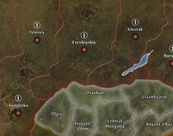
Irkutsk
(Yakut SSR)
Or
Irkutsk
(Yakut SSR)
You seemed to want a map as geographically accurate as possible.
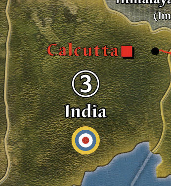
Changing Calcutta dot for instance.
Keeping blatant mistake in naming region might upset you someday.
No?
That’s why I’m saying is there someway to keep accuracy and solving correspondence issues one way or another.
I can have my own kind of OCD for these not so little details.
:-D
We can even tell the story of map designer about how they inversed Yenisey and Evenkiyskiy position and take Yakut for Irkutsk…
(It can even be another factor about printing or not such a wonderful work for my own purpose.)
Another aspect which might come at you one of these days, are you going to have a lot of strategy discussion around these three Soviet Territories?
Once printed, you are going to live with it.
I might also suggest you may, please, please, please, simply put an alternate file with the correct names on due place (no additional correspondence markings, just right names). So, people may choose which map they want. All geographic correspondences right or G40 correspondences right.
Please…
:-)
You are so near of a totally clean map on so many perspectives.