Tjoek's 1940 Global Map file and setup charts (Updated May 30th 2018)
-
Added first release of my map file
LAST UPDATE: May 30th 2018
A&A 1940 OOB Maps - Cleanest Version
Tjoek’s 1940 Global Map fileHere you can find matching setup charts for both the 1940 and the 1942 scenario.
Cleanup
-
Removed all scratches
-
Fixed many issues on the map due to stitching the different scans together and/or the folding lines on the map (e.g. diagonal lines on neutrals didn’t run straight, borders where strange most noticeable in Switzerland)
-
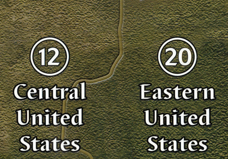
Fixed issues on map due to artwork mistakes on the original board itself (e.g. water texture in Eastern United States, mirrored island in United Kingdom, Calcutta and Sidney now have a square capital marking instead of circle victory city marker, Malta didn’t have a shore, etc)
-
Removed adjacent to text on territories (as they are not needed in 2nd edition)
-
Enhanced contrast of most text
-
Balanced colors to hide seems between different scans, especially visible in the Pacific
-
Himalaya thicker stroke around text, similar to the other text on the map
-
Re aligned sea zone borders so that they are now lining up properly, so all lines run perfect vertical or horizontal
-
Re centered most of the sea zone numbers as well as the convoy and kamikaze markings
-
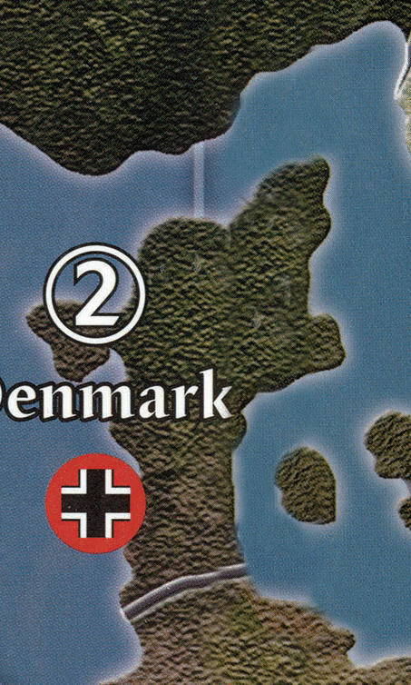
Re centered names of many territories like Denmark, Northern Italy, Mexico, Victoria, Urals, etc
-
Replaced all roundels with same but more vibrant artwork based of the vector images in the rule books
-
Aligned roundels to have equal vertical spacing with territory names
2nd Edition changes
-
Yukon and British Columbia are merged into Western Canada
-
Added border between Alberta Saskatchewan Manitoba and Central United States
-
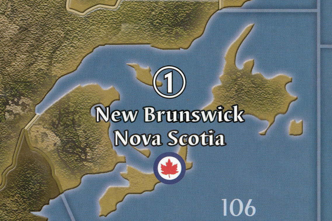
Added border between Quebec and New Brunswick Nova Scotia
-
Made Mexico longer to end at bottom of Sea Zone 10
-
Correct spelling of Palau
-
Correct spelling of Suiyuan
-
Removed ‘Burma Road’ name
-
French Equatorial Africa layout change so it is now in line with rest of the board (first line wider then second line)
Enhancements
-
Removed standing army icons on neutrals
-
Re centered territory names of neutrals and changed Switzerland to the same font size as the other territories
-
Correct spelling of Chinese territories:
-
Anhwe -> Anhwei
-
Hopei -> Hopeh
-
-
Correct names of Russian territories:
-
Evenkiyskiy -> Yenisey
-
Yenisey -> Evenkiyskiy
-
Yakut S.S.R. -> Irkutsk
-
Timguska -> Tunguska
-
Volgograd -> Stalingrad
-
Samara -> Kuybyshev
-
-
Iwo Jima in right orientation
-
Honolulu in right location
-
Calcutta in right location
-
Removed big non existing island ‘Atlantis’ from Sea Zone 44
-
Replaced adjacent to text markings in sea zones with cleaner just numbers solution slightly enlarged since preview
-
Removed Mobilization Zones and Axis and Allies logos from both corners
-
Added Italian Fasces roundels
-
Territory/Sea Zone enlargements:
-
Bessarabia and re centered Western Ukraine
-
Gibraltar
-
SZ 110
-
-
Moved borders between SZ 108 and SZ 109 as well as SZ 118 and SZ 119 to the left to more clearly show SZ 109 and SZ Z119 are connected
-
Repositioned Stalingrad to not overlap with the border of the territory
-
Made Panama Canal a bit smaller so it looks more like a channel instead of an open sea
==================== ORGINAL FIRST POST BELOW ===================
-
The boards are first edition and don’t incorporate some small adjustments to the board that came with 2nd edition. Like Alberta & Central United States now sharing a border as well as Quebec and New Brunswick.
-
The original board had already seen tons of battles and as a result the digital scan shows battle scars and stains across the map.
-
Due to the difficult job of stitching together the different scans and seems in the board some malformation of territories, borders or names are present.
-
-
How are you able to post a picture that “moves” and shows before and after?
Next how do you remove the imperfections from the scan of the map and just retouch the artwork with either the water or land textures? What program is that CS3?
-
@Imperious:
How are you able to post a picture that “moves” and shows before and after?
Create an (animated) GIF, rename the file extension from gif to jpg, embed or upload the “fake” jpg.
Great work, Tjoek!
-
Cool nice job! Incase you didn’t know, im already redoing the map, not that mine is better or anything, but its totally rescaled in Europe/Africa just incase that’s something that interests you. If not, then keep going man, nice to see more map editors.
-
@Imperious:
How are you able to post a picture that “moves” and shows before and after?
Animated GIF as P@nter replied correctly. Using many of the online gif makers (I used gifmaker for no specific reason) it’s very simple to creat your animated gif. Next I’ve uploaded them to mediafire and that gives you a jpg link you can use when you press the “insert image” option. I actually got the idea of posting it this way on siredblood’s new map thread. He used it there as well.
@Imperious:
Next how do you remove the imperfections from the scan of the map and just retouch the artwork with either the water or land textures? What program is that CS3?
I use a great open source program called GIMP. Call if the open source photoshop if you want. But despite the tool the trick is to manual copy-paste similar looking areas and blend them in by making the edges of your pasted area more transparent. It’s a time consuming task and often takes mulitple attempts before it is ‘right’.
-
Cool nice job! Incase you didn’t know, im already redoing the map, not that mine is better or anything, but its totally rescaled in Europe/Africa just incase that’s something that interests you. If not, then keep going man, nice to see more map editors.
Thanks siredblood! I’ve seen your thread and really looking forward to your next sneak preview. Although I understand the reason for rescaling parts of the map, I personally don’t like it that much.
Maybe that’s just me being from Europe and disliking the way my lovely continent transformed into an obese monster :wink:
-
An update on Latin America. I’ve finished the face lift.
Brasil gave me some challenges as the board fold goes straight through this country. This wouldn’t be a big problem if it wasn’t a Pro Allied neutral with the angled lines running through it. The solution to restoring those lines to run straight again was to move the bottom half of the continent only slightly downwards and fix the textures over the original fold line.
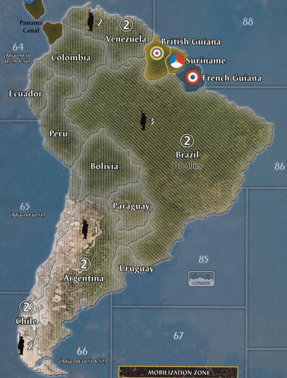
Don’t bother the white pixel noise on the right sight of the images. This is an artifact from the animated gif creater. It’s not there in reality.As an added bonus I decided to remove the standing army symbols for the neutral countries. I will be playing with neutral miniatures and will create a setup chart similar to the other nations. So no need for this extra clutter on the board. This layer is optional, so when I’m done I will share the files both with and without the neutral standing army symbols.
Next stop: Europe!
-
South America is too long now. I’ll never be able to sail around it on one tank of gas. :-P
-
South America is too long now. I’ll never be able to sail around it on one tank of gas. :-P
Well sir, buy yourself a nuclear sub :-D
-
After some hard work and playing our second game of Global 1940, I’ve finished Europe and have reworked Africa for 80% now. The project of reworking the great map from Ambilzi and Young Grasshopper is taking far more time then expected, but the results are very satisfying. So let me share with you the biggest challenge in Europe: Switzerland. It’s in the middle of a crease and split across two boards. And with the size of the country there’s is not much original artwork to play around with. Please let me know what you think of the results
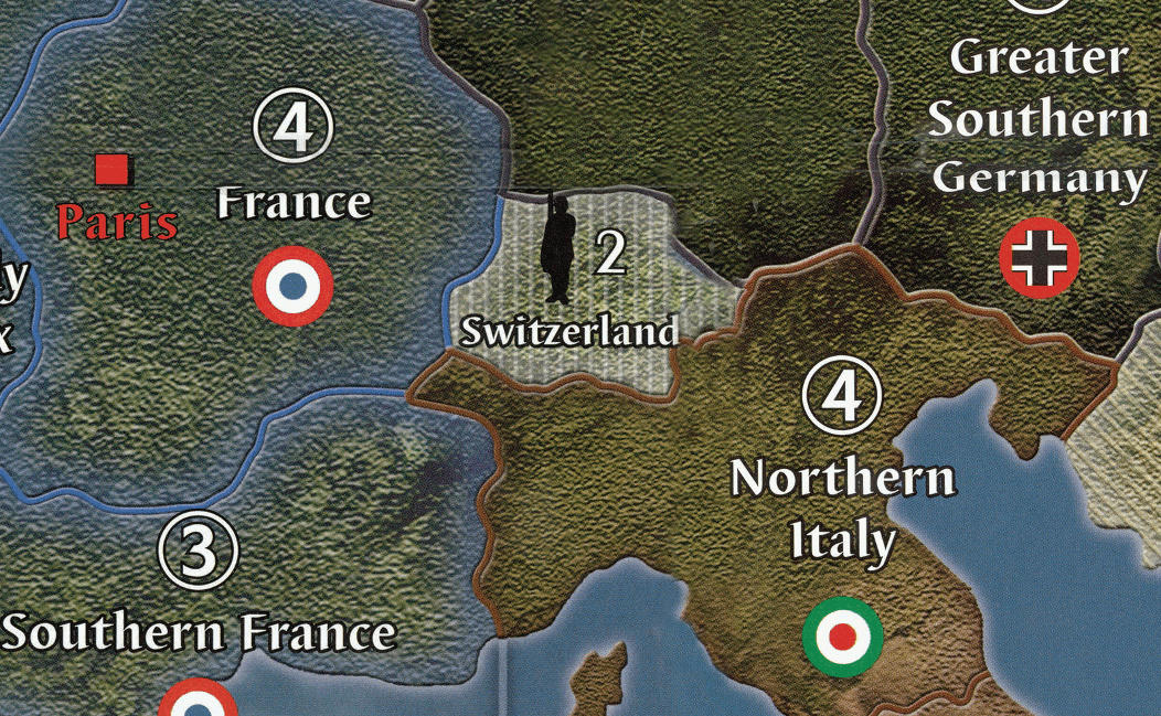
Please note that the coast of Northern Italy as well as the crease (and text distortion) on both France and Greater Southern Germany have been fixed as well. This part of the board has given me some hard time :-)
-
Really great work so far! I also plan to print myself a map and with your project going on at the moment, I will pretty sure wait for that to be finished :-)
I know, you already plan 2 versions with different layers, like the standing armies on neutrals.
What features of the Ambilzi/YG map will you keep on your map? Or will you go with the plain original map? Will there maybe be more than 2 Layer Versions?Personally, I would especialy find the Naval/Air Bases very useful and the extended income tracker.
-
I know, you already plan 2 versions with different layers, like the standing armies on neutrals.
What features of the Ambilzi/YG map will you keep on your map? Or will you go with the plain original map? Will there maybe be more than 2 Layer Versions?I’m working with the plain original map, because I like a clean map as a map only and have all the other stuff like battle boards, cost charts, income tracker apart from the board.
But with this ‘clean’ map as a basis, it shouldn’t be a big challenge to blend back in the naval and air bases or any of the other features from the full Ambilzi/YG map.When I’m done working on this map, I’m more then happy to create you a blend. If you are kind enough to share me some pictures of your printed map / table :-)
-
When I’m done working on this map, I’m more then happy to create you a blend. If you are kind enough to share me some pictures of your printed map / table :-)
That sounds like a fair deal! :-D
-
A quick update. Africa and the Middle East have been fixed. Especially the neutrals in the Middle East proved to be challenging. Now rolling into the USSR.
-
Your right about the font, i now remember that the Franklin font looked better so i went with that.
-
@Imperious:
Your right about the font, i now remember that the Franklin font looked better so i went with that.
That’s not a problem. Do you happen to know what the original font was called?
-
I stopped looking because that Franklin font is better and sorta similar to OOB
-
Yes!! Finally managed to finish the European Theater of the map. Just for you all to get a feeling of how big this rework is to fix all the dust particles, scratches, fold creases and scan line - I’ve added a picture that shows all the changes to the original map.
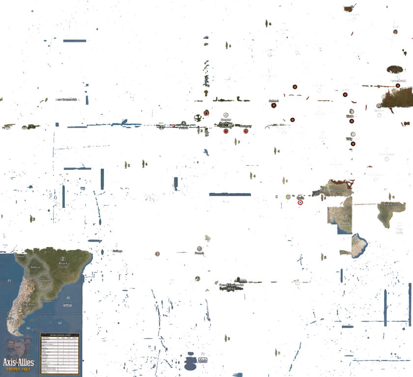
The results are very satisfying and I cannot wait to finish the Pacific theather and get this clean map printed.
-
WOW, you can really see where the boards were stitched together.
-
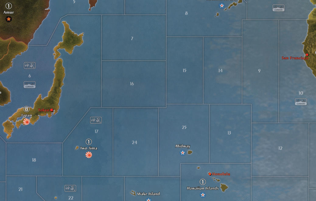
Quick update to you all. 6 months have passed, but not without progress on the map! I’ve fixed all lands / islands except for America on the pacific board. This work took forever to complete, but I’ve learned a lot on this journey and will retouch some of the things on the european side as well. Especially better contrast on country names.
I’m currently battleing my way through the pacific to minimize the visible lines of where the scans have been stitched together. See this image as a reference of what I’m talking about.
Please note I’ve also:
-
aligned sea borders better and in straight angles
-
moved Honolulu to where it should be
-
flipped Iwo Jima to it’s right orientation (inspired by Intrepred’s great work)
-
it’s still WIP as you can see from the dark line running north of Wake Island and through Hawaii
Let me know what you think!
-


Suggested Topics

