


All my boards are on 5mm foamex boards.
Waterproof, fade proof, and really hard wearing
Tjoek's 1940 Global Map file and setup charts (Updated May 30th 2018)
-
@Imperious:
Your right about the font, i now remember that the Franklin font looked better so i went with that.
That’s not a problem. Do you happen to know what the original font was called?
-
I stopped looking because that Franklin font is better and sorta similar to OOB
-
Yes!! Finally managed to finish the European Theater of the map. Just for you all to get a feeling of how big this rework is to fix all the dust particles, scratches, fold creases and scan line - I’ve added a picture that shows all the changes to the original map.
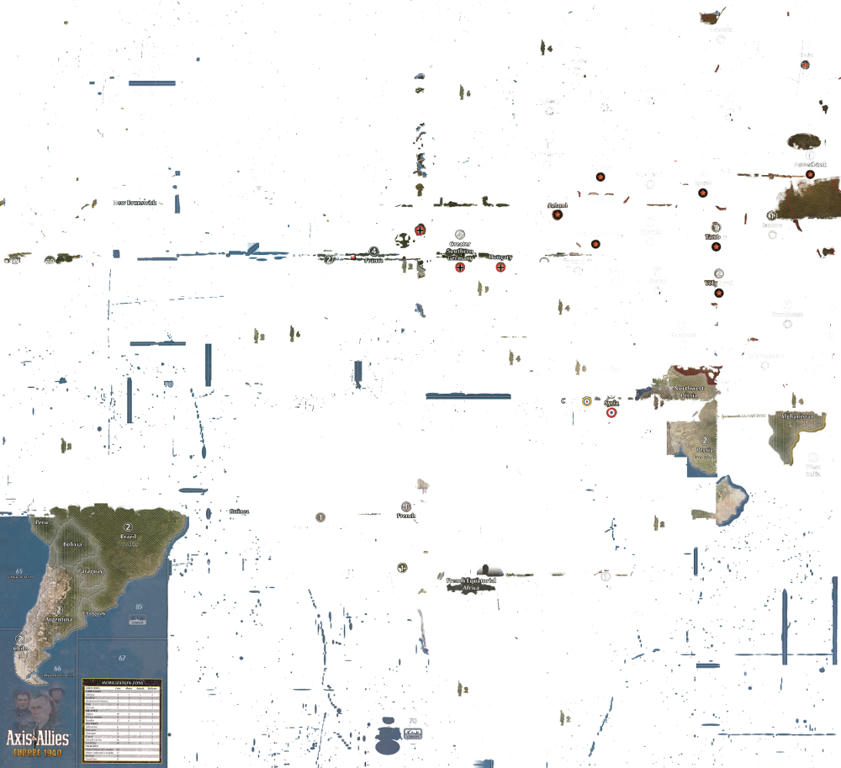
The results are very satisfying and I cannot wait to finish the Pacific theather and get this clean map printed.
-
WOW, you can really see where the boards were stitched together.
-
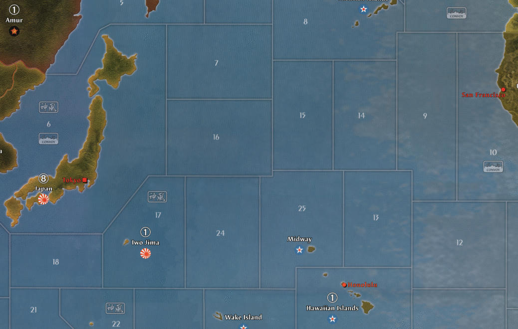
Quick update to you all. 6 months have passed, but not without progress on the map! I’ve fixed all lands / islands except for America on the pacific board. This work took forever to complete, but I’ve learned a lot on this journey and will retouch some of the things on the european side as well. Especially better contrast on country names.
I’m currently battleing my way through the pacific to minimize the visible lines of where the scans have been stitched together. See this image as a reference of what I’m talking about.
Please note I’ve also:
-
aligned sea borders better and in straight angles
-
moved Honolulu to where it should be
-
flipped Iwo Jima to it’s right orientation (inspired by Intrepred’s great work)
-
it’s still WIP as you can see from the dark line running north of Wake Island and through Hawaii
Let me know what you think!
-
-
Just a quick update to let you all know this project is not dead. After some months out of the running I’m regaining energy and started working on this map again. Still some work to do, but I hope to be able to get you posted on a more regular basis.
See my separate thread for my OOB map of Axis & Allies Anniversary Edition. This is what I’ve been working on the last week after contacting Young Grasshopper when I saw the problems with the warped boards on his Youtube channel.
-
Awesome….can’t wait to see the final product
-
Nice! Looks like we both are back to maps at the same time!…. think we began around the same time as well.
-
Nice! Looks like we both are back to maps at the same time!…. think we began around the same time as well.
Yes I think you’re right. It’s some serious map time for the community :wink:
-
Some good progress lately. I’ve finished retouching all the scratches and other small damages on the boards / scans.
As I found a way to scan my own boards in good quality I was even able to use my 2nd edition board itself to add the 2nd edition changes to the map. See the two examples below for Western Canada and Mexico (left: original map file from YG, right: 2nd edition changes). Note that using my own scan I was able to regenerate the original artwork on Western Canada and Western United States without visible color differences.
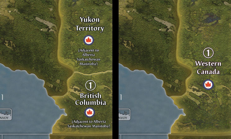
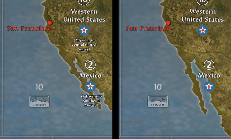
Next stop: color correcting the visible overlaps between different scans. They are visible in the sea zones. Especially on the Pacific side of the board.
Stay tuned!
-
This map looks great! Looking forward to completion :-)
Looking at the 1st edition pacific board, I’ve also noticed that Sydney and Calcutta have the round victory city symbols rather than the square capitals symbols… at least that is what the first edition board looks like, maybe it’s rectified in the 2nd ed. Calcutta mightn’t need one since it’s part of the UK, but it is essentially a capital. I corrected this myself on YG’s board but you might want to do it on your own board.
Checked my 2nd edition OOB boards, and indeed they still have the round VC symbols. Great spot!
-
This map looks great! Looking forward to completion :-)
Thanks!
I’ve also noticed that Sydney and Calcutta have the round victory city symbols rather than the square capitals symbols…
Wow never noticed this before! Thanks for sharing this with the community. I will definitely address this.
-
This map looks great! Looking forward to completion :-)
Looking at the 1st edition pacific board, I’ve also noticed that Sydney and Calcutta have the round victory city symbols rather than the square capitals symbols… at least that is what the first edition board looks like, maybe it’s rectified in the 2nd ed. Calcutta mightn’t need one since it’s part of the UK, but it is essentially a capital. I corrected this myself on YG’s board but you might want to do it on your own board.
Checked my 2nd edition OOB boards, and indeed they still have the round VC symbols. Great spot!
This map looks great! Looking forward to completion :-)
Thanks!
I’ve also noticed that Sydney and Calcutta have the round victory city symbols rather than the square capitals symbols…
Wow never noticed this before! Thanks for sharing this with the community. I will definitely address this.
You’re very welcome for the spot… it’s what happens when you have a bored guy staring at a game board :lol:
-
You’re very welcome for the spot… it’s what happens when you have a bored guy staring at a game board :lol:
If you are ever bored again, please do stare at the board again and share your finding :-)
-
-
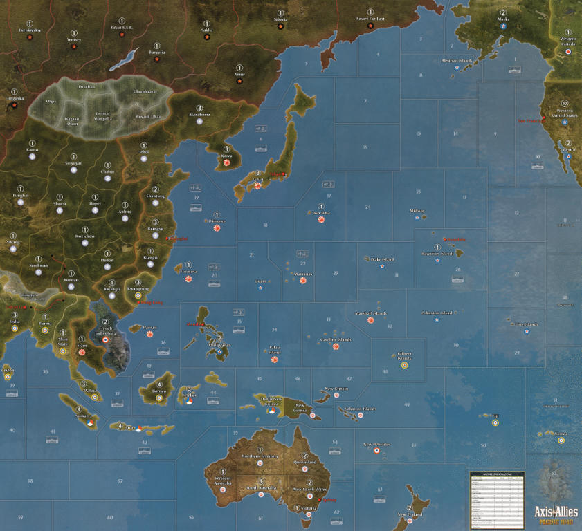
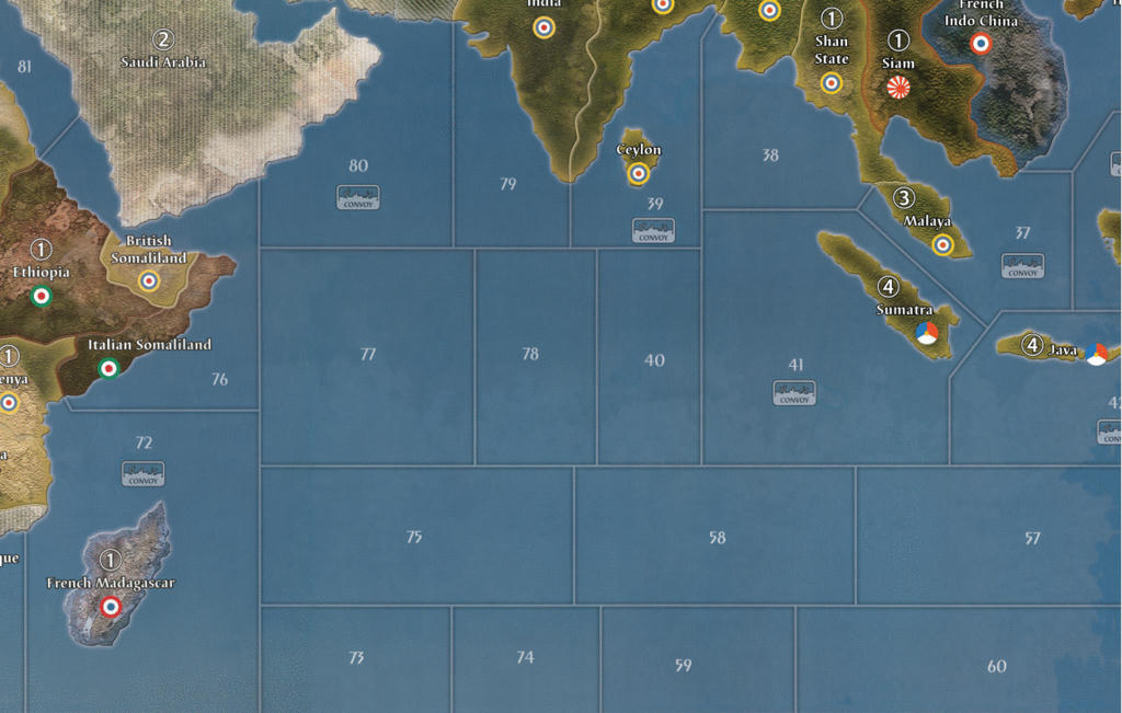
After finishing retouching all the scratches and other small damages on the boards / scans it’s time to work on the bigger picture. Resulting in some good progress. I’ve been working on the color differences in the sea zones and have finished the pacific and indian ocean. If I mist a spot please let me know. :wink:
What you can see in the images:
-
The color balanced sea zones off course
-
The removed neutral army icons (as I play with miniatures from HBG)
-
2nd edition changes to the board (West Canada, Mexico, no Burma Road name on the board, Palau Island spelling correction)
-
fixes to the board (Iwo Jima in right orientation, Honolulu to the right location)
-
Himalaya stronger black stroke on text (exactly as other text on the board)
-
Calcutta and Sidney now show the square capital instead of the round VC icon. Once again thank you for spotting this sjlr1.
-
Anything I missed to tell you 8-)
Pacific
Indian Ocean
-
-
Looks great! :-)
Those colour corrections make a real difference -
While your fixing things, I listed more errors on my thread, misspelled china territories, Calcutta is in wrong location, etc, the list is right before the newest pics on page 12.
-
While your fixing things, I listed more errors on my thread, misspelled china territories, Calcutta is in wrong location, etc, the list is right before the newest pics on page 12.
Thanks sired! I was aware of the Suiyuyan -> Suiyuan that needs to be corrected, but it seems you changed far more names. Could you share the source of these changes? I did some “googling” but found many different spellings of same areas and some were hard to find to begin with.
And I will look into Calcutta.
An other thing on my todo list is the horrible fake island near Celebes. But first I will focus on finishing the sea zones on the Europe side of the board.
Suggested Topics

