


@vodot yeah I think I have done a first pass need to work out what’s the best format to publish in
Sired's Map project - Updated- 4/16 - files available see first post
-
You’re a busy man! Really looking forward to seeing this project progress. :-)
Another question; are you going to keep the connecting land between Scotland and Northern Ireland? From a gameplay perspective I can see why you’d do that, seeing as the two countries belong to the same zone, but it just looks a bit weird to me to see it like that. Looking at the origial map though, they’ve put the UK roundel right where that land bridge is on your map, maybe you were planning on doing the same?
Regardless, you’re doing great work here. Keep it up!
-
The land mass in that pic don’t show the country lines, as it was a water pic of the convoy (which is way batter now, same design method though)
My goal, in less I fk it up, keep the gameplay 100% in tact (which I thank for helping me do so) im not trying to change values or lines, if I do, its on accident and needs to be fixed.
Thanks again for keeping me in check, ill post an updated pic prior to the weekend. I still have lots of crap im trying to do, one of which is the vid for the painted units flyover… time just slips away :( I need 50hr day cycles!
-
time just slips away :-( I need 50hr day cycles!
Don’t I know it. Take it easy, man. Don’t sweat it. Burn-out is a real thing. Post something when you can, if you can.
You’re doing a great job, keep it up! Looking forward to your next update!
-
Excellent work, I’m looking forward to printing one off and showing it in my YouTube videos.
-
@Young:
Excellent work, I’m looking forward to printing one off and showing it in my YouTube videos.
That would be dope :P
-
Just about to wrap up the map water/Sea zones/Convoy, etc …. I noticed on my 1999 Europe map, it has ocean names on the map, im toying with the idea, what do you guys think?
Anyway, I may have a pic up tonight of the progress, if not, tomorrow for sure. I have my scheduled cleared for the next 8hrs, so its map time, along with some rum and redbull :)
-
I like the idea of the ocean names if you have the right font and they are transparent enough not to steal the focal point. Never really liked those random illustrations floating around in the empty sea spaces… maybe a nautical compass if there’s room some where.
-
I was thinking the same, very transparent for the ocean names
Ill be painting/tinkering the next few hours with the water still,but I wanted to show a pic of the overall map, you can see everything was pretty much adjusted with the exception of the Americas. The islands in the pacific were made slightly larger, England grew, obviously the main reason for the project, a bigger Europe, smaller Africa. Spain I shrunk, I would rather more room in the French territories, and ya, I know spain looks weird, but I was the necessary evil to keep reasonable sea zones and keep the game lines in tact. Some of the other small islands were also enlarged, Crete for one, cant recall the others right now :)
I also removed a few little island specs I thought were more or less in the way, I don’t think we needed 2 little islands in Norway taking up the sea zone, just did a few of those to make better use of the sea zones.
I haven’t 100% decided the hue of the water yet, will be adjusted to the mainland colors after I paint (starting tomorrow)
Hope to have more pic up over the weekend. The hard part is over, After I paint its pretty much done, then its just tinker/adjust. This file has over 400 layers, will be over 500 after I add the IPC values, whoowe!

-
Great stuff. Looking forward to seeing it progress.
-
I like the added room in the Baltic Sea. Staring at the flashing map freaks me out after a few seconds though, lol.
-
Thanks for the comments guys! In addition to the Baltic area, I also increased the distance from UK to Normandy, was pretty tight before.
I finished the water last night as planned, again, im not sure on the HUE/Saturation/Etc yet, ill tone in once the land is done, The water has been merged down to 4 layers, but I can still all sorts of tweeking when the time comes. I took this pic, not only to show the water, but the convoy and kamikaze silhouette.
The convoy/kamikaze still may get tweeked, but that’s them as of now, the black will more then likely be hued to match the BG once I decide on a shade.
Im in the process of pasting on satellite pics of the countries to give me painting references.

-
I really like the kamikaze symbols!
The color not so much, but they may change a little bit as you’ve written.
Also you have rightfully concentrated on europe with your resizing work. But while you are at it, maybe we can think about some places in asia that are a bit too small in contrast to the amount of units there in a standard game.
Right on top of my head I was thinking about Hawaii and Malaya. For the latter maybe snitch a small chunk of Shan state?
And while not really practical at all, for some time now I would love a tiny corner of antartica hinted deep down in the south. Impassable of course.
Doesn’t add something to the game, but I kind of like the idea for unknown reasons :)
-
I made Hawaii a tad bigger, probably not enough though, I was already thinking of adding a blowup box in the bottom corner where the unit chart was (as I removed those)
Malaya, ya, we can fudge some borders :)
-
I love the colours you used for the water… really like the subtle tones from light to dark around the shore lines to open sea… my only concern is how dark it is overall, I like the 1940 water because it’s light enough, however, I don’t like looking at the 1942 2ndE board because the water colour is so dark.
-
This would be the best map so far. The water nuances are perfect. Try not to make it like the oob map. Even adding some islands ( Maldives, Azores) would make it nicer.
-
I too like your convoy and kamikaze markers a lot. Way better than those on the OOB map. They flow nicely without the box around them.
Have you thought about making the kamikaze diving or at some angle relative to the x axis of the board? It looks good as-is, and you don’t want it to be obtrusive; however that could make it a little more dynamic. Could require a different image though.
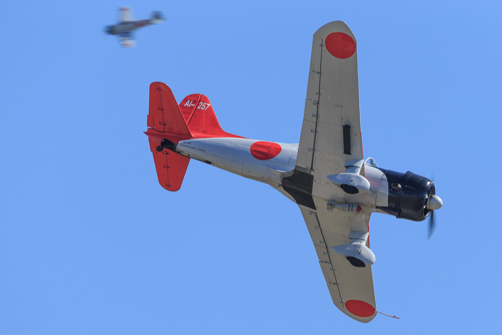
And is that a Val with the wheels chopped off?.. It kinda looks like a Dauntless silhouette. People may not notice, but it would be fundamentally wrong if it were an image of an American plane. … meaning I would find it a near sacrilege. :lol:

Maybe something like so, in silhouette? Or showing the discs on the wings? I really don’t know how detailed you want to be when that small:
-
Or

-
Thanks guys for the comments, im happy to know the progress approval is up more so then down :)
I actually wanted the plane in a dive, but it took up more space then I wanted, and ya, I cut the wheels so it would fit better with the writing, but I guess I should put them back to distinguish it better. Ill also toy with maybe a slight pivot.
And ya, I can see adding Azores, give that huge void a little pizazz.
Tomorrow ill be gone all day, so I wont be able to get new progress pics till Monday/Tuesday. Going to spend the rest of the night finishing up my card deck.
Thanks again for the comments, they are all very helpful!
-
I actually wanted the plane in a dive, but it took up more space then I wanted, and ya, I cut the wheels so it would fit better with the writing, but I guess I should put them back to distinguish it better. Ill also toy with maybe a slight pivot.
Gotcha. I figured as much. Good to know.
Vals had fixed gear, so that’s why I wasn’t sure.
-
I can honestly say I never paid attention to it being fixed, when I looked at your pic you posted, I noticed and knew ok, gotta put’em back lol.
Suggested Topics

