I have been playing around with different configurations for a custom table and wanted to note some things I’ve landed on that I really like. A main one thing is having the map mounted so that it can slide around as needed on top of a bigger playing area. My table is 65” x 95” in total with a 5.5” arm rest around the outside and the middle is a recessed neoprene surface. I have the OOB Global map mounted on 1/2” rigid foam with a 1/2” aluminum frame around it. This allows the map to slide up close to whoever’s turn it is, but then be in the middle so both players can roll dice In front of them without disturbing the map and in easy view of the other player. (Plus we like lots of room to roll the bones). This ability to adjust the surface along with a standing height, makes it comfortable for long uses because you can move around more and don’t feel as tied down.
Things I’ve learned and changed from original design - I originally used too big of a frame for the map and mounted it on too high of a foam block (you can see these pictures at the bottom) - it made it hard to see the other player’s dice and the big frame took up too much real estate. My global map is mounted on much thinner foam (the framing is bad, you can see if you look closely) but I also used much thinner aluminum angle for the frame. This gives just enough grip when needing to move the map around (I use furniture slides on the bottom, which glide very nicely on the neoprene) but doesn’t make the whole thing too bulky. Having it an inch or so off the surface keeps the dice off, but isn’t so heigh that you can’t see the other player’s dice rolls. When playing other versions (such as Zombies) the board is much smaller, but it can easily swap in and out on the same table since it can move around where ever it is needed or be pushed aside.
I originally made it normal table height, but found long reaches while sitting were harder and it just felt cramped. Standing height with a bar stool is a great way to have the best of both worlds.
The 5.5” rim around the table itself gives you a nice arm rest that doesn’t interfere with the gaming surface. I’m playing with how to best add some cushion to this part - open to suggestions. Sometimes I just lay a piece of leftover neoprene on it.
Dice bounce nice on the neoprene and stay off the floor. It also feels nice and has enough give to allow things to slide but be picked up easily. Wouldn’t definitely go with neoprene again as a surface covering.
I made the drawers open to the inside of the table so you can stay hunched over the action while accessing and stowing stuff away. 50/50 on whether I would keep this if I were to do it again. If I were doing it again, I might try to build customer drawers form scratch using actual drawer glides, but that was beyond my ability when I first did this, so I just used clear plexiglass boxes with aluminum pulls mounted on them. It’s nice having them clear, and I was happy with how the pulls came out, but without glides they can be a little fussy sliding in and out of their slots.
I originally designed the table so that I could put a cover surface back on top when not in use, but find I don’t really ever do that, so if I were to do it again, I might not mess with that part (I never even finished staining those as you can see in the pictures).
CF362D52-269F-4480-8CBB-08139099138F.jpeg A9E12EA1-66EB-4671-86AC-68C62FD30AD5.jpeg 858DE1F2-030A-4D5A-93E4-70A7D1180ADB.jpeg 8F513EE0-DA37-4BA9-880E-4D5EF7BF431F.jpeg F0188165-757B-4CC1-BF67-5045832283C9.jpeg 2E3CD627-0D31-4121-ACF8-682F9F58A40B.jpeg
AXIS & ALLIES map from Hearts of Iron
-
Some years ago I was creating a map of the world to a sort of Axis & Allies … giant map 300 cm long (3 meters :-P).
I started from the map of the PC game Hearts of Iron, making screenshots of the monitor and then joining all.
I have not had time to develop it, but if someone want the files, can download at this link on my forum: http://www.medioevouniversalis.org/phpBB3/viewtopic.php?f=6&t=98&p=17152#p17152 … for each step there is a file to download high-resolution between 20 and 40 MB.I hope it can be useful to some of you to create its map :wink:
DETAIL:
–--------------------------------------------------------------------------------------------------------------------------------------
DETAIL:
–--------------------------------------------------------------------------------------------------------------------------------------
DETAIL:
–--------------------------------------------------------------------------------------------------------------------------------------
DETAIL:
–--------------------------------------------------------------------------------------------------------------------------------------
DETAIL:
–--------------------------------------------------------------------------------------------------------------------------------------
DETAIL:
-
Impressive-looking maps – thanks for sharing. I have a few questions:
-
According to what system are the maps divided into smaller map areas? In some places, like the United States, the map areas correspond to several states grouped together; in other words, they show separate jurisdictions being combined into larger regions. In some places, the reverse is true: single jurisdictions are broken up into many pieces. This is especially true in Europe, where there is an extremely large number of pieces.
-
According to what system are the map territories named? In North America, for instance, the southern third of the province of Quebec is shown as being a defined region (which it isn’t – I live there), and as far as I can tell from the small print it’s labeled “Montreal”, which is the name of a city not the name of a region.
-
According to what system is the coloured map coloured? It shows, for instance, parts of Germany and Belgium in one colour and parts of Germany and Holland in another colour.
-
What year are the maps set in? 1939 or 2016 or some other year? I tried to figure it out by looking at the coloured map, but I got confused because the countries are broken up into a large number of regions, and because the coloured map connects them in ways that are puzzling (as I mentioned in the previous paragraph).
-
-
@CWO:
Impressive-looking maps – thanks for sharing. I have a few questions:
- According to what system are the maps divided into smaller map areas? In some places, like the United States, the map areas correspond to several states grouped together; in other words, they show separate jurisdictions being combined into larger regions. In some places, the reverse is true: single jurisdictions are broken up into many pieces. This is especially true in Europe, where there is an extremely large number of pieces.
Unfortunately I do not remember the reasoning that I had done so, I believe it was 1998 when I created it.
The first step was the original map of Hearts of Iron, the last step was the point where I had stopped to working on the map.
It was a prototype, so surely there are some mistakes on the boundaries that should be corrected.
I think I joined the smaller territories to create fairly large territories for the miniatures of Axis & Allies.@CWO:
- According to what system are the map territories named? In North America, for instance, the southern third of the province of Quebec is shown as being a defined region (which it isn’t – I live there), and as far as I can tell from the small print it’s labeled “Montreal”, which is the name of a city not the name of a region.
The name of territories in the first step are the original of Hearts of Iron.
@CWO:
- According to what system is the coloured map coloured? It shows, for instance, parts of Germany and Belgium in one colour and parts of Germany and Holland in another colour.
The colors are the various types of terrain:
light green is the plain
green is the forest
dark green is the jungle
beige is the desert
light brown is the hill
dark brown is the mountain
gray is mountain range HimalayaSurely in Europe there is something to fix to use it during WWII… it was one of the my first prototype and I did not have much experience.
@CWO:
- What year are the maps set in? 1939 or 2016 or some other year? I tried to figure it out by looking at the coloured map, but I got confused because the countries are broken up into a large number of regions, and because the coloured map connects them in ways that are puzzling (as I mentioned in the previous paragraph).
Yes, sorry, but if you have time to create a correction draft on my map, I could fix it … we could do one continent at a time …
-
Unfortunately I don’t believe this map would work for Axis and Allies since areas like Europe must be unrealistically enlarged to fit all the playing pieces. In Hearts of Iron the map can be more realistic since you can zoom in and click on small stacks of computer icons.
-
Thanks for the information, Veldriss. I agree with Der Kuenstler that using this map for A&A would be a problem, both for the reasons he gives and for a few other reasons which I’ll describe briefly.
First, any A&A game has to have a clearly defined starting date, with a map that matches it. The rules, the political situation, the starting setup of units and the map territories all have to work together; the A&A games set in 1940, 1941 and 1942 are all very different, and rightfully so. My understanding of Hearts of Iron is that it starts in 1936 (presumable due to the Spanish Civil War), which is four years earlier than A&A Global 1940, the A&A game with the earliest starting date (not counting A&A 1914, which deals with WWI rather than WWII).
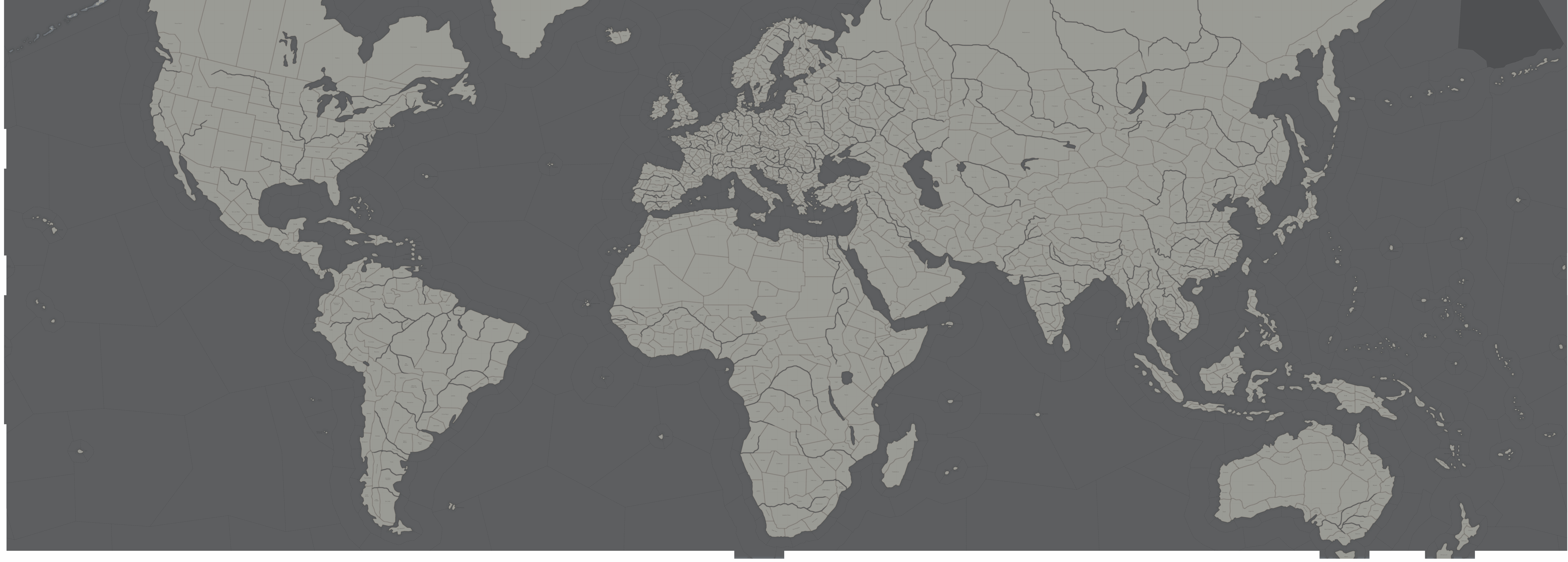
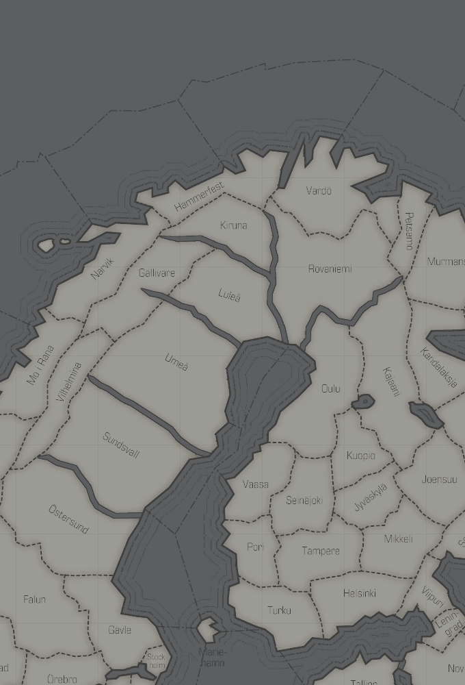
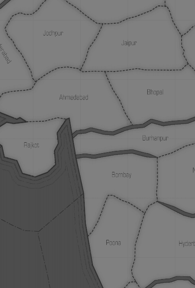
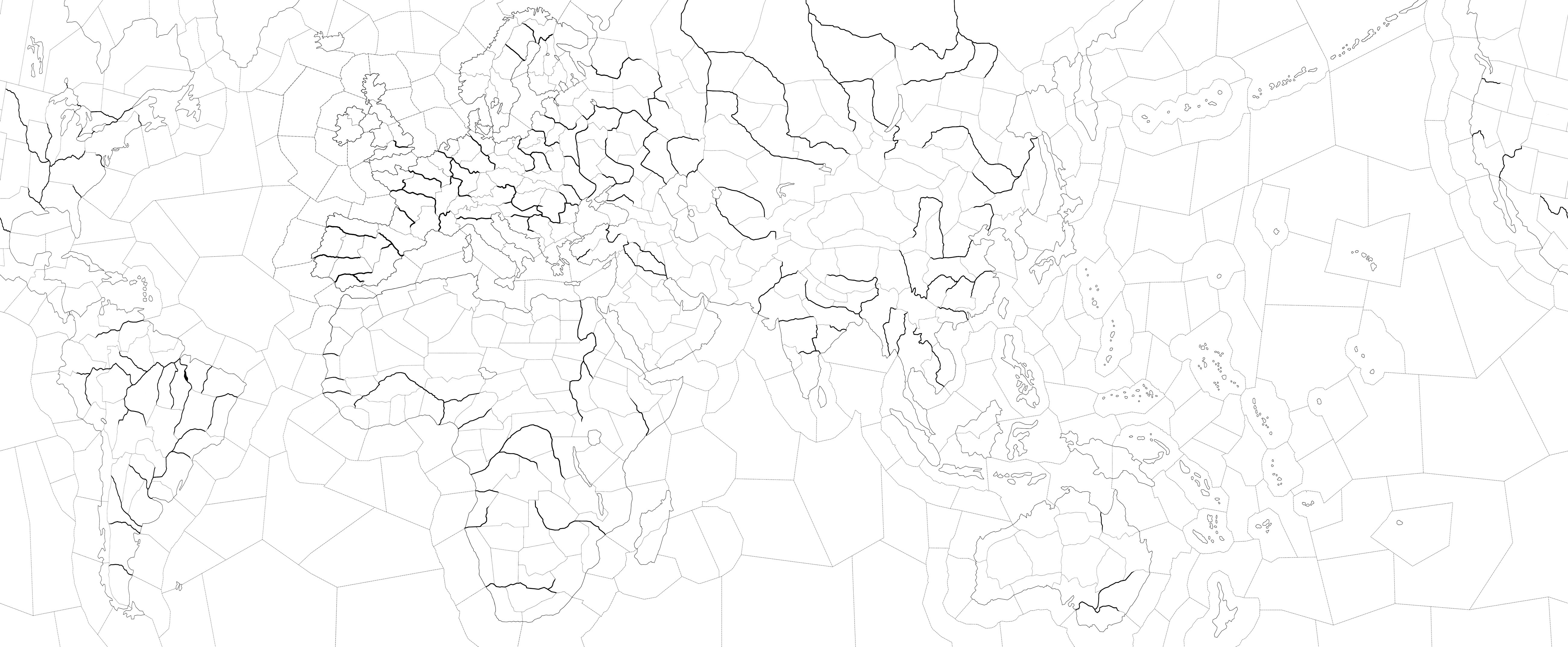
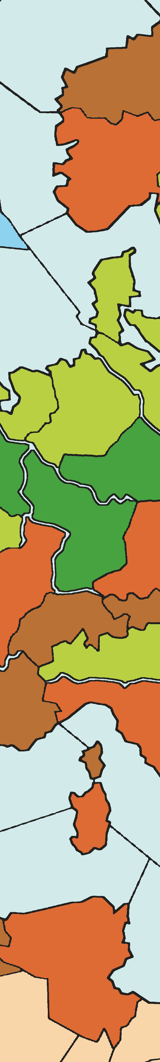
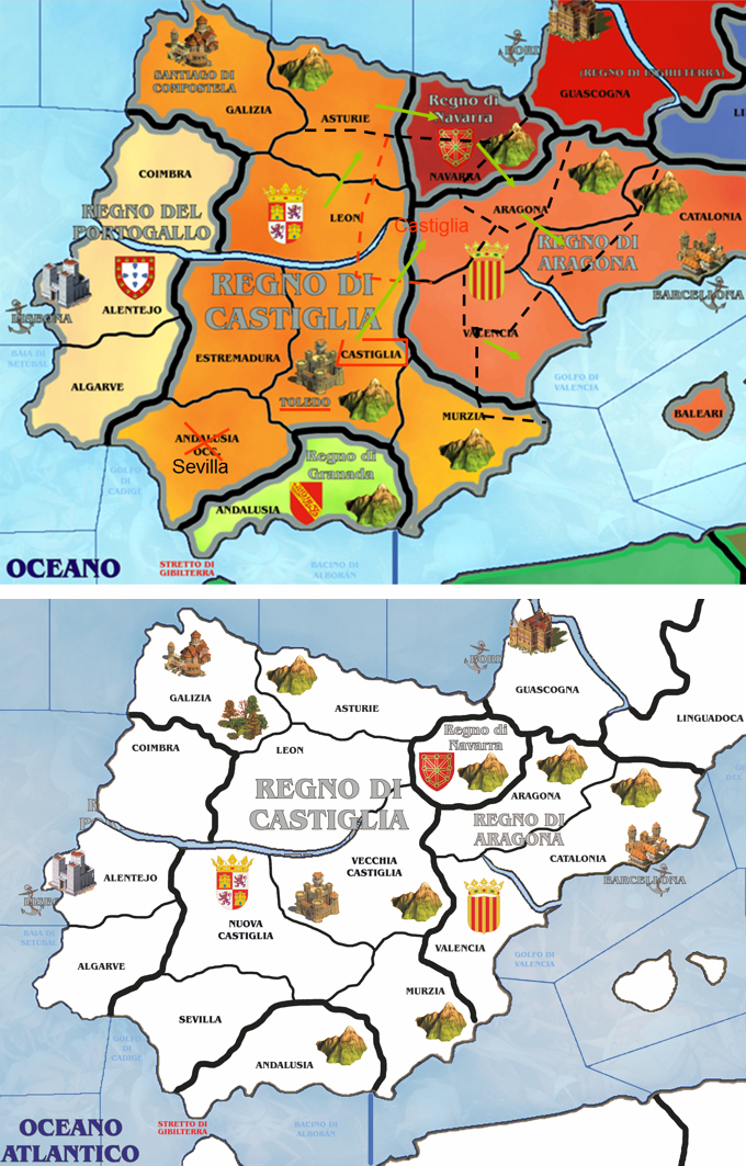
Second, any map for a game with an area-based movement system has to have a system of territorial divisions that is correctly scaled for the game’s movement rules. The maps shown here have many more divisions than the A&A Global map. If we keep the A&A rules which say that a particular unit can move 1 space per turn, it will take that unit much longer to travel across (let’s say) Europe on these maps than on the regular Global map. The only way to compensate for that would be to change the rules to increase the number of spaces that a unit can move in one turn…and that would potentially unbalance the game.
Third, the map colouring here places the emphasis on terrain features rather than on political status. This is very confusing from an A&A perspective because in A&A it’s political status that counts the most. The newer-style A&A maps (like Global 1940) do actually “look” topographical (in other words, they look a bit like a colour satellite picture of the Earth’s surface), but most of those topographical elements are purely decorative; what really matters are the artificial territorial subdivision lines. Other than the basic land/sea division, the only terrain features in Global 1940 that function as true terrain modifiers are the three impassable ones: the Sahara, the Pripet Marshes and the Himalayas.
Fourth, the map would need IPC values assigned to each territory. IPC values are fundamental to A&A because A&A is driven by a four-step engine: territory generates income, income buys units, units fight battles, and battles win territory. Figuring out which territory ought to have which IPC value under a set of house rules would not only take a good deal of time, it would probably involve a lot of controversial debate because a lot of people would have different opinions on the subject.
These maps are certainly very attractive – I like them a lot – but unfortunately adapting them from a computer game to a very different board game might not be possible if the maps are kept at they are. They’d probably require a major redesign of many elements.
-
Thx CWO Marc, I agree with you and Der Kuenstler.
There is still a lot of work to do to turn this map and make it usable for Axis & Allies System.
I remain available to make the necessary changes if someone wants to help me with drafts like this example:
This is an example of a map that I created for a medieval boardgame (CLICK IMAGE TO ENLARGE):
-
That is very impressive.