
Rough in the Diamond
-
I never really weighed in on this one, but of course, like every board, I just swooped the re-release lol. I wanted the sculpts even though the colors wouldn’t really be my top choice. The map still gives me vertigo though. I’m curious if the decision to go diagonal for this map was intentional in order to prevent the thing from translating onto a monitor or modern screen?
Dead space on a monitor is a little different than deadspace on a table that can be filled up with unit trays and snacks or whatever. And a diamond is a lot more deadspace than a black bar going from 4:3 to 16:9. Or even 1:1 or 1:2. Like you put it on its side and presto, it’s instantly this massive chore to translate the map onto a screen in a satisfying way haha. I really wonder if this was by design, which would be clever, even if a bit annoying for me personally hehe.
Quick Q, has anyone already morphed this thing for a Horizontal orientation?
I don’t mean redesigning the map to add tiles or make the borders more historical or whatever, but simply to port the game as is (vanilla) but on a regular rectangular field. I was going to attempt it, but it’s a fair bit of work, so if it’s already been done figured I’d ask.
I’ve heard people say the map needs to be this way to fit Africa. I’d disagree. There’s already plenty of distortion going on, a stretch could achieve something very similar without too much added space on the flanks/ocean. Running the max height along the diagonal and putting it inside a square is very limiting in my view. Like of course the thing has to be squat at 32 inches on it’s sides, since top to bottom thing would still need to fit on a regular table at the diagonal and that’s like what already topping 44 inches. This means that unless you have a very beefy table, or two tables stacked together, or a giant card table, that you’re going to have to lay it out Horizontally anyway right? I mean that’s what I did for the other one when I first bought it. And then everyone is sitting around looking at it’s gangster lean lol.
Also not a huge fan of a bunch of oblique and curved lines for all the sz divisions, I’d aim to make those a bit more regular in the angles I guess. I was tooling around with the experimental one that XimZero made, since it uses some of my old work, thought I might try to clean it up or revamp.
I mean I’m looking at this right here, or the OOB board, and thinking ok but is that really better/more practical than something more like this that just stretches wide again?


I didn’t make that one, it was Xim baseline, but I think you could preserve a lot of that OOB distortion, or continue to blow out Europe to be a fair bit larger. Like I don’t know, maybe even twice as large?
I’m curious, when you guys lay this out on the table/s do you present it in the Diamond or do you just tilt to horizontal? If everyone is doing the latter I think I’d just lean into that and morph the map back into horizontal orientation. Obviously I’d want to rework the projection a bit and the coastlines and such.
ps. for an overall design, instead of a Diamond/Rhombus thing going on, I was thinking a pseudo cylindrical type projection, with that sort of elliptical motif. Then you could keep some curved sz lines like OOB, or give that vibe like a fun-house mirror/magnifying glass. Sorta like the Mollweide world projection I guess https://en.wikipedia.org/wiki/Mollweide_projection
just more exaggerated, since it’d be mostly centered on Europe, with anything outside that focus under pretty heavy distortion. Anyway, that kinda deal, with an ellipse inside a rectangle rather than a diamond field, though obviously the ellipse wouldn’t be an equal area design, it’d be like one of those optical illusions or power of suggestion things. So sorta like, you see the curves and then extend the idea in imagination, and so it makes sense when you see it start to wrap/contort towards the edges. Then just toss a couple insets for staging units or design elements to make it feel complete.I absolutely love the cover art on this box. And I love the WW1 theme and a lot of the rules and such I think are fun and novel, but the map could be a lot larger right? I mean for the tight spots like the low countries or where the various powers converge onto each other. Just seems like having more room there for Europe would be a plus. I think perhaps some of the design artwork that is on the cover of the box/manual, those montage design elements could just be inserted into the map itself at the margins (eg the stuff outside the ellipse/game field).


-
I think the map can definitely be bigger. I don’t like using chips and when you only use pieces, the Western Front is way, way, too crammed.
With the exception of Africa, the Ottoman Empire, Russia, and the US, all the territories in this game need to be double or even triple the size to fit all the pieces.
-
@superbattleshipyamato im sorry but using pieces only is a ridiculous goal. you need to be using chips.
-
They look better though…
-
@Black_Elk I understand that 1914 is a Europe-centric board. But it just bugs me how they distorted Africa so horrendously…
-
How did they distort it (sorry if that sounded too confrontational)?
-
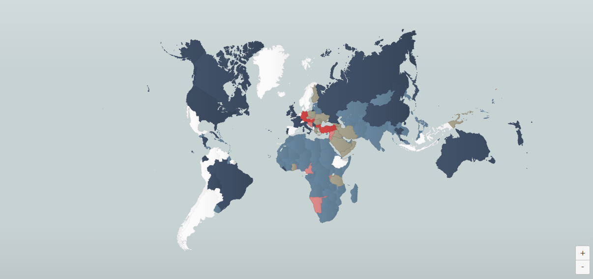
This is an interesting map that attempts something sort of similar in the projection, or similar sort of rotation on Europe at any rate, though without showing the bottom of Africa…
Those are clearly more recent political boundaries hehe, but perhaps something like that with an inlay box for the bottom of Africa? Like instead of distorting the shape you could just sorta crop in on Europe and do the peripheral stuff like the North Atlantic and South Africa as an inlay box to left or right side of the main playing field. If keeping a square format you could do it on the lower left like a zoom out view where the Sahara/West Africa shows below. Or could go wider on the sides to use more of the table than a square. Might work. Like you could just sorta abstract an obvious sz connection between the stuff shown on the main Europe map and whatever side panel arrangement.
https://www.theworldwar.org/interactive-map


-
Cool. I think it works. If using the smallest one you’ll also need to add India.


Suggested Topics

